Real Projects
Real Solutions
- All
- blog
- booking
- corporate
- corporate
- E-commerce
- fashion
- magazine
- web-sajt

Demetra
A website designed to be a reliable and accessible source of information for modern women. We created a WordPress portal that allows easy navigation through rich and diverse content. The focus was on readability, clear organization, and a pleasant visual identity that empowers and inspires.

Marie Claire
For a renowned fashion and lifestyle magazine, we created a WordPress platform that combines clarity, functionality, and the brand’s recognizable aesthetic. The site is designed to support a dynamic flow of content and provide an enjoyable reading experience—whether on desktop or mobile. The design is clean and sophisticated, serving the content that inspires.

Bizu
A fusion of Asia and Europe translated into a visual identity that is modern, sophisticated, and distinctive. For this restaurant, we created a WordPress solution with a focus on online ordering, allowing users to quickly and easily choose their meals. The design follows the brand’s story – a blend of styles, flavors, and cultures in a digital form.

Elia
Elia is more than just an online shop – it’s a carefully crafted space that reflects the brand’s lifestyle. Through the site’s design and functionality, we supported their vision of feminine strength, effortless living, and everyday elegance. A WordPress solution that’s as inspiring as it is functional – easy to use, and visually aligned with the spirit of the Elia community.

Faculty of Sport
An informational website for a higher education institution required careful structure planning and clear communication. We created a clean and functional WordPress site that provides students, professors, and prospective candidates with quick access to all key information – from study programs to current application calls.

Sixth Element
For the Sixth Element brand, we created a complete WordPress solution – from website design and development to search-optimized copywriting. The homepage combines video and static visuals to convey the brand’s atmosphere at first glance. Every element of the site is carefully crafted to align with the brand’s aesthetics and values.

Damar Shop
For the Damar brand, we developed a WordPress store with a design that fully reflects their recognizable visual identity. Special focus was placed on clarity and ease of use, ensuring a shopping experience that is fast, simple, and pleasant – without unnecessary steps or distractions.
Arsenal Fest
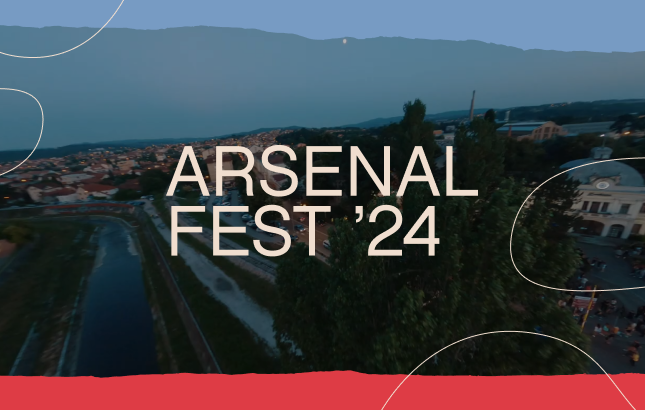
In creating the website for the renowned Arsenal Fest, our priority was to capture the atmosphere of the event itself and the dynamics of the music genres presented there. Through the use of vibrant colors, dynamic video footage, and precise lineup representation, we managed to create a website that stands alongside other major festivals, while also bringing to life the spirit of Arsenal Fest.

Legacy International
Legacy International sought a simple and modern design for its corporate website, emphasizing the importance of easy navigation and user-friendliness. Our team responded to these requirements by designing and developing the website according to the latest UI and UX design standards, with the addition of a simple administrative panel for ease of use.

Aleksandra Radović
Our client, Aleksandra Radović, wanted her website to provide audiences with a complete overview of her extensive professional journey, including her career, music, performances, singing school, and access to her online porcelain product store. Our team successfully harmonized all these elements into a seamless and intuitive website design, allowing visitors to effortlessly delve into every facet of Aleksandra’s artistic and entrepreneurial pursuits in one convenient location.

AVW
AVW required a WordPress site that not only showcased their products but also provided a smooth user experience. Our solution involved crafting a custom design coupled with intuitive navigation, resulting in a website that effortlessly guided visitors through their offerings.
Marijana Kovačević
Our client sought a minimalist design that would provide insight into her diverse professional portfolio. Our team met these requirements by creating a website that combines subtle aesthetics with a simple interface, allowing visitors to explore Marijana’s rich career in an elegant and efficient manner.

Frendo
Approaching the design provided by the client for the Frendo website, our team successfully transformed complex elements into a high-quality web platform. Through meticulous planning and execution, we achieved a harmony between aesthetics and functionality, providing visitors with an intuitive experience that reflects the vision and purpose of the Frendo brand.

Kvad Experience
Through our design and development for the client Kvad Experience, we successfully authentically conveyed the experience they offer in their services. By combining video, images, animations, and vibrant colors, we created a dynamic and appealing website that reflects the richness and excitement of their adventures.

Bogdan Bogdanovic
At Bogdan’s request, we crafted a powerful website that impressively showcases his personality and the Foundation’s activities. By blending black hues and dynamic animations, we achieved a striking aesthetic, all while upholding a simple site structure and optimizing information layout for the best visitor experience.
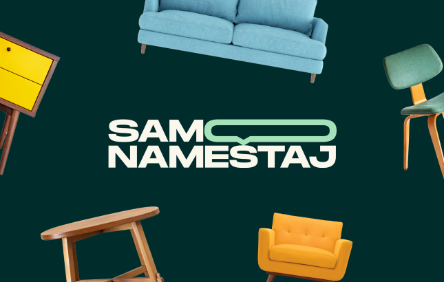
Samo nameštaj
“Samo Nameštaj” provides a unique experience for furniture enthusiasts, combining furniture showrooms, the ability to post ads, and advanced product filtering in one place. By blending these advanced functionalities with top-notch design, we managed to create a website that elegantly guides users through all aspects of the offerings.
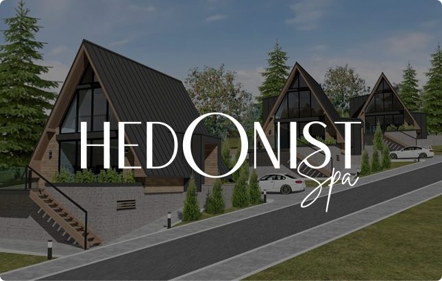
Hedonist Spa
Our clients from Hedonist Spa provide users with a detailed insight into their rich apartment offerings, offering the possibility of direct booking through the website. Visitors can easily select their desired apartment or filter the options by location or date, while beautifully displayed apartments with accompanying images facilitate the selection and booking process.
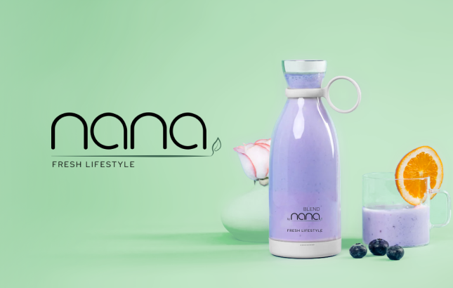
Nana
For our client, we designed and developed a shop with a focus on a maximally simple payment process. Through an intuitive design, we enabled a fast and efficient checkout process, aligning with their desire to promote a healthier lifestyle through the aesthetics and messaging on the website.
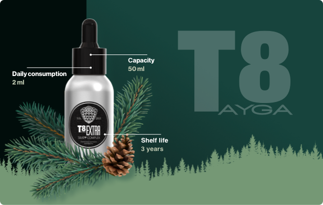
T8 Extra
For our client T8extra, we created a website focusing on product presentation, highlighting its features and benefits. Our design enables visitors to clearly see all the characteristics and values of this product, emphasizing it as the central element of the site.

Do Edu
We crafted a one-page website for the DoEdu platform, aiming for simple and visually appealing representation of all its aspects: its target audience, benefits, and services offered. Our modern and straightforward design allows for clear information display, making it easily accessible to visitors.

Majo Public
Majo Public sought a visually striking design, emphasizing the need for abundant images and videos, while also desiring optimal site speed and optimization. Our team effectively met these requirements, providing them with a design rich in multimedia content, while ensuring the speed and efficiency of the site.

Shoppsy
For the Shoppsy platform, we crafted a fully branded website, including the logo, designed to attract and retain users’ attention on the site. Our design blends attractive visuals with an intuitive user experience to create a memorable journey.
Balkan Children
For Balkan Children, the priority was to facilitate and reliably enable donations through the website, while also ensuring that the visual experience was attractive and clear. Our design focused on simplifying the donation process, with a clear and aesthetically pleasing presentation, ensuring users have a positive experience throughout the entire process.
Tampon Zona
Tampon zona is our client who emphasized the desire for the website to highlight the podcast segment, followed by a shop with a simple and fast purchasing process. Our focus was to meet these requirements by integrating the podcast and optimizing the shop for easier and more enjoyable user experience.
Paloma Grand
Paloma Grand, our client, is a florist who emphasized the importance of focusing the website on a simple shop with efficient filtering options and an informative blog section. Our team successfully met these requirements, enabling users to easily navigate through products and access useful content via the blog.

Retold
Retold, our client, sought a web shop capable of supporting a wide range of their products. Our solutions enabled efficient management of a large number of products, ensuring an optimal shopping experience for website visitors.

Miamara
Miamara is our client who wanted a simple corporate website to present and promote their products. Our design reflects the essence of their brand story and enables visitors to easily familiarize themselves with their offerings.
Steven Dockman
For our client, we crafted an original online shop in line with their brand philosophy, emphasizing easy navigation and a smooth ordering process. With support for a large number of products, the focus was on a visual approach to the products and modern design tailored to young consumers.
Minotti
For Minotti, our client, it was necessary to create a website showcasing a wide range of brands and products, as well as allowing users to download catalogs. We developed a website with numerous animations that not only contribute to the aesthetics but also guide users through the story of the brands and products.
Okret
Our clients sought a clean, functional, and modern design that reflects their aesthetic. Additionally, we implemented a simple administration system to make website maintenance easier and more efficient.
Bombaj Textile
For Bombaj Textile, we created a website that is a harmonious blend of a clearly defined shop, a prominent focus on products, and brand stories told through photographs and texts. Our design is carefully coordinated to highlight the products and allow visitors to connect with the brand through its story and visual identity.

Squadplan
For Squad-plan, we crafted a unique design that highlights their services in an original way, while setting them apart from the competition. Our focus was on creating an attractive and recognizable website that effectively showcases all aspects of their business and captures the attention of their target audience.
Eurus Klime
For our client Eurus Klime, we’ve developed a website featuring clear product categorization and highlighted the advantages of their services. The design is simple yet provides users with an intuitive experience and swift access to information about the company’s products and services.
Cubes
For cubes.rs, we’ve crafted a website with a carefully thought-out design that follows the brand’s story, allowing visitors to familiarize themselves with the company’s values and offerings in an intuitive and engaging manner.

Hosting Hero
For Hostig Hero, we’ve crafted a one-page website with a unique design that effectively highlights the brand’s services. We designed it to be easily maintainable while providing users with an intuitive experience and quick access to information.
BigCMS
For Big CMS, we utilized a color palette to accentuate the various advantages of this CMS platform, with a particular focus on services, projects, and functionalities. The design was carefully crafted to highlight key aspects of the platform, providing visitors with a clear insight into everything Big CMS offers.

Mob shop
For Mob Shop, we designed a website that meticulously showcases product categories to be clear and enticing to visitors. We implemented simple navigation and special sections on the site highlighting specific categories or offers, enabling users easy access to desired products and special deals.
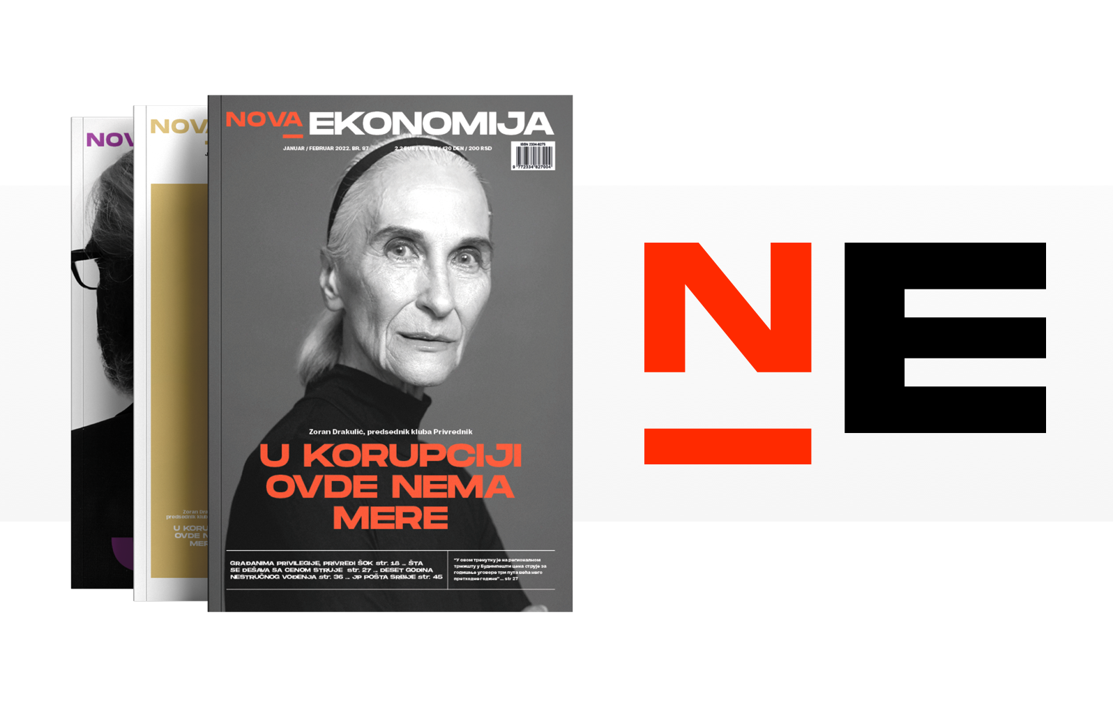
Nova Ekonomija
For Nova Ekonomija, a publication dedicated to economic news, we developed a design and structure focusing on creating a unique identity. What sets them apart from other publications is their modern design and the way they present their content, written by top industry experts.
Velike priče
“Velike Priče” is a new website that delves into serious topics and operates on a subscription basis, providing members with exclusive access to high-quality content. Additionally, the site offers its podcasts, further enriching members’ experience through video-audio format.
Nedeljnik
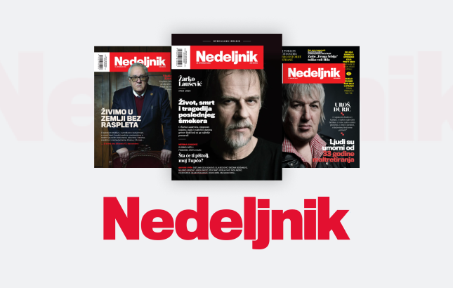
For Nedeljnik, one of the key requirements was to merge two separate websites – the online platform Nedeljnik and Nstore, their online store. Our task was to ensure that this integration was not only visually seamless but also functionally flawless, aiming to enhance user experience and contribute to the creation of a higher-quality website.
CafeBar & Restoran
Tasked with enhancing their online visibility, CafeBar&Restaurant required a WordPress website optimized for search engines. Our strategic approach to custom development and design ensured their site not only looked great but also ranked well, attracting more visitors and leads.
Bravacasa
With a vision for a distinct online presence, Bravacasa sought an informative website that stood out in a competitive market. Through meticulous custom design and branding, we brought their vision to life, delivering a website that captured attention and drove engagement.

Armada
Armada Trucking sought a unique website that reflected their brand identity. We tackled the challenge by creating a custom WordPress site with tailored design elements, ensuring a seamless blend of aesthetics and functionality.
